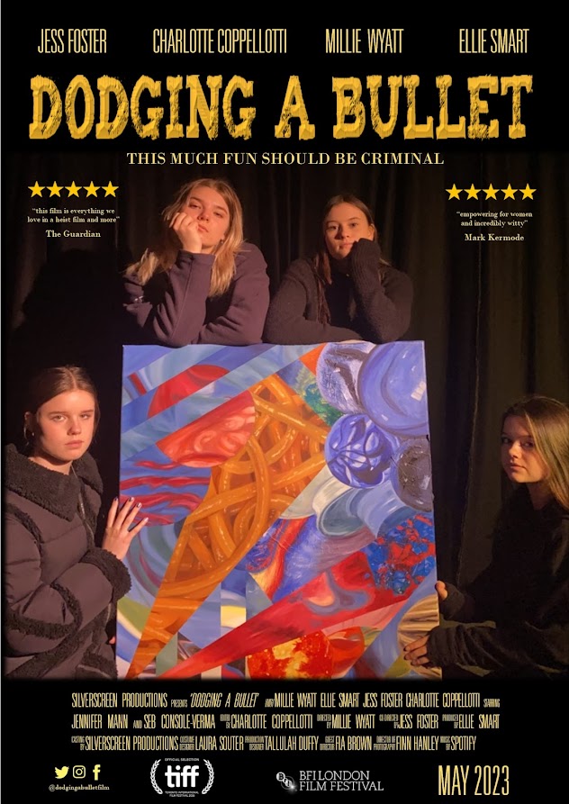
In order to research film posters, I analysed those from Black Widow, Rocketman and Greta. After researching what information features on a film poster and the typical layout, I started drafting out ideas on paper. Once I had a design chosen, I used Microsoft PowerPoint to edit images and Cool Text to design the title and bought it all together using Microsoft Publisher.
OFFICIAL DODGING A BULLET POSTER:
DRAFT IDEAS FOR POSTER:

These drafts were not used as I wanted to bring focus to the fact the film highlights women empowerment and therefore I felt it was important to make the focus of the poster the women criminals rather than the mansion. Equally, the painting is a major subject of the film and so the overall look for the poster includes the criminals holding the stolen artwork. The draft with the mansion didn't end up working as the colour schemes were not what I was looking for as it would have included the green grass and blue sky. Instead, I wanted a dark black, shadowed colour scheme as I thought it looked slick and more professional as I had limited access to editing applications: by using a black background, it meant the film awards, the social media logos could all be edited using a low-quality software but still look professional. Equally, black meant I could use brighter colours to make the main information of the poster really pop and stand out such as the title, the tag line and the reviews which all used a gold/yellow colour. Furthermore, black gave a sense of mystery and threat which matched the connotations of robbery and criminals which I would not have been able to achieve if I had used bright colours and a picture of the mansion in broad daylight.
RESEARCH:


