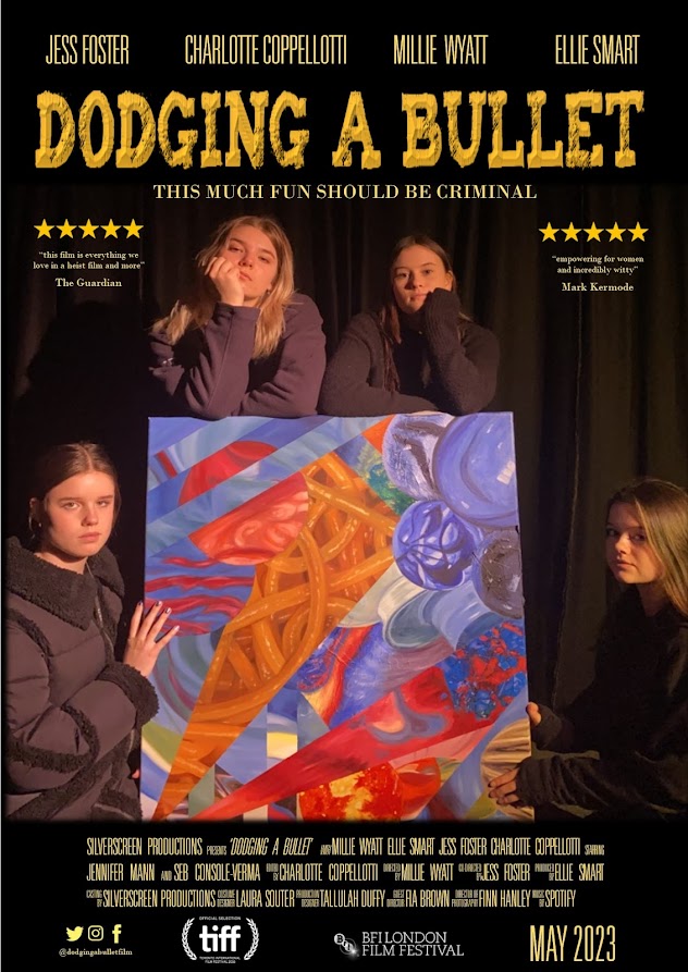
In order to research film posters, I analysed those from Black Widow, Rocketman and Greta. After researching what information features on a film poster and the typical layout, I started drafting out ideas on paper. Once I had a design chosen, I used Microsoft PowerPoint to edit images and Cool Text to design the title and bought it all together using Microsoft Publisher.
OFFICIAL DODGING A BULLET POSTER:
DRAFT IDEAS FOR POSTER:
These drafts were not used as I wanted to bring focus to the fact the film highlights women empowerment and therefore I felt it was important to make the focus of the poster the women criminals rather than the mansion. Equally, the painting is a major subject of the film and so the overall look for the poster includes the criminals holding the stolen artwork. The draft with the mansion didn't end up working as the colour schemes were not what I was looking for as it would have included the green grass and blue sky. Instead, I wanted a dark black, shadowed colour scheme as I thought it looked slick and more professional as I had limited access to editing applications: by using a black background, it meant the film awards, the social media logos could all be edited using a low-quality software but still look professional. Equally, black meant I could use brighter colours to make the main information of the poster really pop and stand out such as the title, the tag line and the reviews which all used a gold/yellow colour. Furthermore, black gave a sense of mystery and threat which matched the connotations of robbery and criminals which I would not have been able to achieve if I had used bright colours and a picture of the mansion in broad daylight.


POSTER BLACK WIDOW
ReplyDeleteThe first of three beautifully presented and detailed analyses. Your articulate reflection on the visual language of layout, colour and mise-en-scene (costumes, stance, technology, weapons) as well as on how the action adventure franchise delivers its message is very well conveyed. You notice small details as well as show a firm grasp of poster genre conventions, such as the use of the Marvel Studio branding, age rating and positioning of star talent. You draw attention to the way in which the poster promotes Black Widow’s USP of the female lead. Polished work.
POSTER GRETA
ReplyDeleteExcellent presentation. You note the intriguing interplay between the visual codes that denote threat / murder, such as the truncated bleeding head, juxtaposed against the superficially reassuring film tagline and sunny backdrop. Certainly Moretz’s alarmed gaze belies any reassurance. Good grasp of the function of the placement of the star talent and the #GRETA to engage specific target audiences. Note spelling: billing block.
POSTER ROCKETMAN
ReplyDeletePolished work both in presentation and in content. You show how the layout reflects the genre (biopic, musical drama) in its mise-en-scene and showbiz glitter. You comment on the iconic and readily recognisable costume, Elton’s huge stage presence, the foregrounding of the protagonist and the creative use of stars and glitter in the title font. You note the showmanship of the camera angle, reinforcing the promise of the film’s ‘behind the scenes’ quality.
In this post you provide detailed evidence of relevant genre research into film posters of a similar type and your finished result shows confident application of poster genre codes and conventions (including all the institutional requirements). You offer evidence of the planning of your design. Your film poster effectively conveys the film's theme with its strong central image of the principals as the centre of visual interest positioned around the stolen artwork, against black curtains which lends a theatrical flourish and denotes the comedic element of their criminal activity. The poster is finished to a high technical standard and observes all genre conventions.
ReplyDelete